.jpg)
CAPE TOWN REBRANDING
.jpg)
City of Cape Town Rebrand
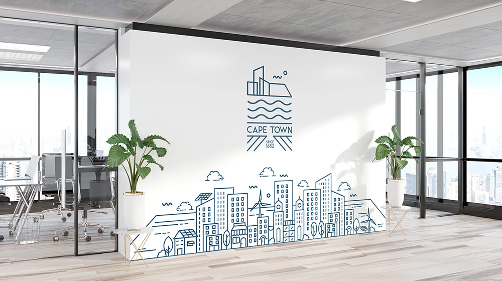
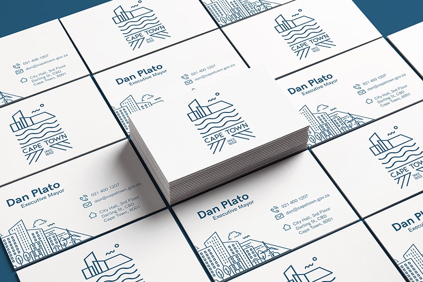
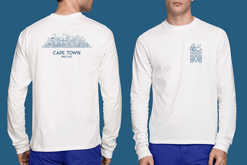
An in-depth rebrand was conducted for Africa's premier smart city; The City of Cape Town. Each element, from the design of the logo, patterns or colour palette was created directly from inspiration taken from the city or it’s surroundings. Simplistic line work was used to capture and embody all the elements which make the city an exceptional place to live. The colour palette was inspired by the iconic oceans and beaches of Cape Town. This pale and naturalistic colour palette was chosen as it not only evokes feelings of familiarity but also of calmness, stability and inclusivity.
Year
2020/21
Client
Cape Town
Deliverables
Rebranding
Logo Design
Digital Design
Graphic Design
The challenge
To conceptualize and execute a rebranding for The City of Cape Town which focuses on the unique locations, attitudes and surroundings of the city and her citizens.
Our solution
The new visual identity makes use of a unique pattern and iconography system, which is inspired by the city’s buildings, tourist attractions and future Smart City projects. Additionally, to express inclusivity & to facilitate collaboration between the city and it’s citizens, a user-generated infinite scroll pattern features on the city’s website. Citizens can submit photos of their favourite homes or businesses and vote on their favourites. Designers will then review the submissions with the highest votes and convert them into line art which will then feature on an endless digital pattern.
